Blackeart & Co.
Packaging Design

Blackeart & Co
Packaging Design
BLACKEART & CO. GIN
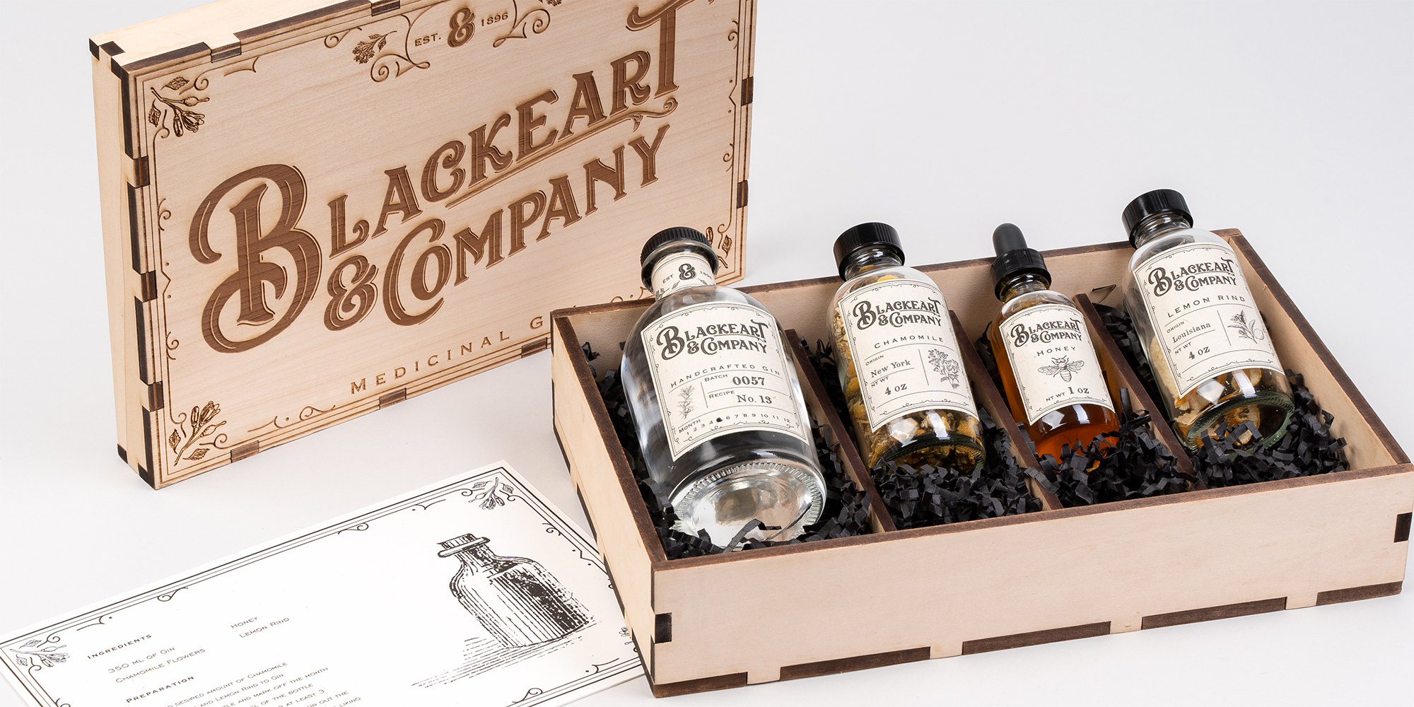
Originally created around the idea of looking like Victorian medicine, Blackeart & Co gin was expanded from a single bottle of gin in to a botanical gin kit which allows the consumer to flavor their own alcohol. The medicinal gin box encapsulates elements of late 1800’s design that was often found on wooden painted signs. Many medicines used in this era were highly concentrated alcohols each with their own individual blend of herbs. Taking classic healing ingredients such as chamomile and honey allowed for me to inject my own knowledge of herbals in to the project. The use of dover etchings from this time period create a delicate contrast to the bold typeface used in the brand.
ART DIRECTION:
Paul Sheriff, Scott Laserow
PHOTOGRAPHY:
Austen Hart


