All Tour

ALL TOUR
For this project, I decided to address a problem many young musicians encounter when touring. As a young band, many cannot afford to hire a Tour Manager or Road Manager, so the business side of things falls on the band. While there are several tour management apps currently on the market, none of these options seem to fit the budget of a small self-managing band, or are too complex for the band’s day-to-day needs. Enter All Tour. All Tour offers the user an easy to use interface that incorporates the most important functions a new band would use. The largest challenge I overcame throughout this project was designing a user-friendly interface that creates an individualized experience for every user.
ART DIRECTION:
Abby Guido
PHOTOGRAPHIC IMAGERY:
Alyson Coletta

RESEARCH
The first and possibly most tedious step to this project was the research. I compiled data on competing apps that had similar functions to my concept, then polled potential users on which of these functions they would find most useful. Looking at how these other apps were designed, I found that most neglected to consider their user. The targeted group for these apps are bands and their crews who tour for a living. Currently, the app that is being used as the industry standard, has a very difficult to use user interface, as well as being poorly designed. Taking this in to consideration, and using my results from the survey I conducted, I set out to create a welcoming brand that drew users in with its simplicity. Keeping in mind a dark interface that would be easy to use in dark places, I adapted the iconography to be visible at all times, thus creating a sleek brand that set itself apart from its competitors. The research process continued throughout the entire span of the project, as users began to test my designs.
NAME & LOGO CONCEPTS
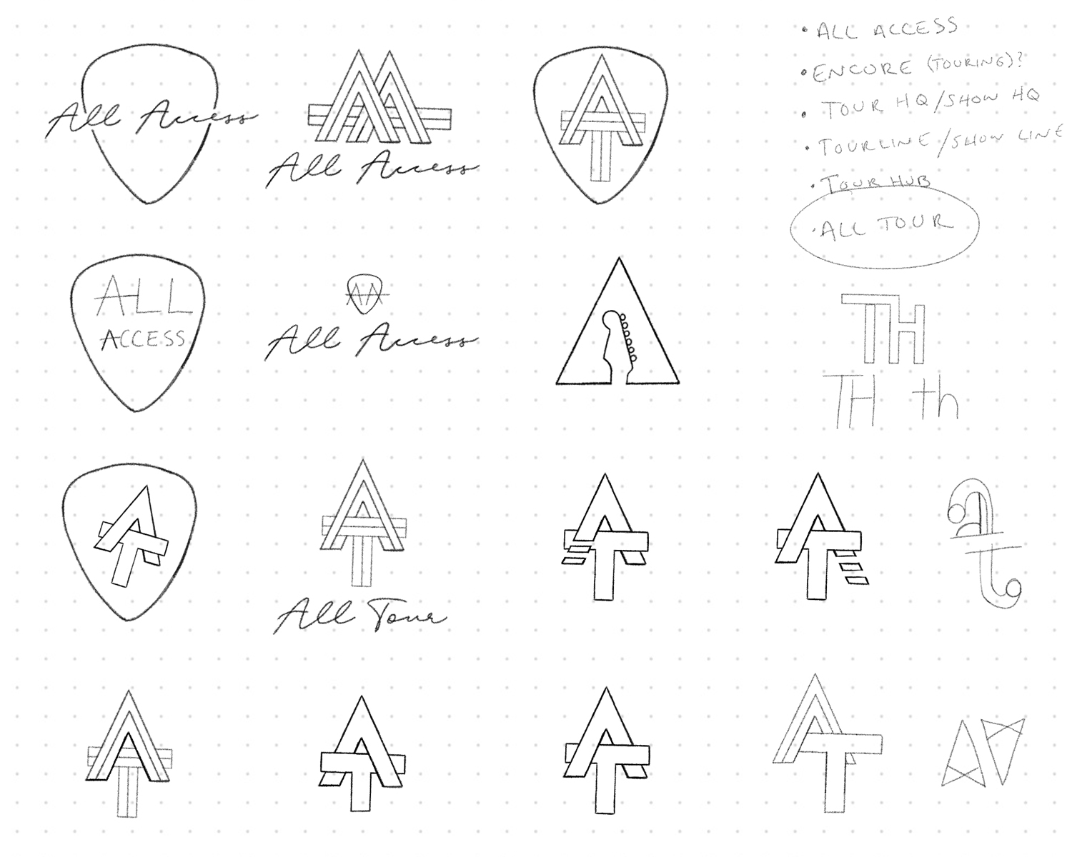
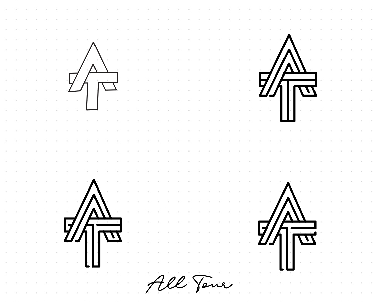
After completing research on competitive apps as well as the industry standards, I set out to brand my new app. A descriptive and well thought out name was crucial to set the tone for the entire project. Settling on the name “All Tour” told the user exactly what they were getting before they ever opened the app. Much of my logo research gravitated towards letter marks and word marks and strayed away from more illustrative works. The new wave of clean monoline design inspired me to create something simple, yet captivating. I knew eventually I wanted to animate the mark to enhance the splash screen of the app, so I made sure to stick with a simplistic structure. My logo design process often starts with rough sketches of related objects, or in this case, letters and words. From a pencil sketch, I then move on to the inking phase which now takes place on the iPad. Traditionally, I would spend time with micron pens, inking each individual line. Finally, the logo sketch is brought in to illustrator and refined using geometric tools and shapes. Being the extreme multi-tasker that I am, additional user research is often conducted during this phase.
WIREFRAMING
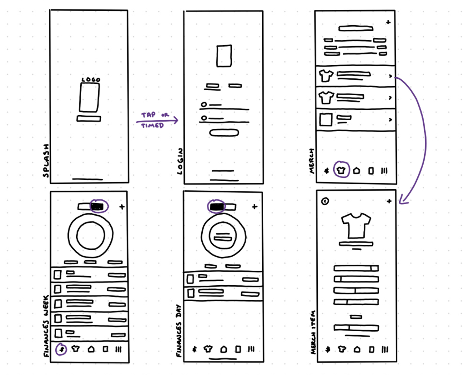
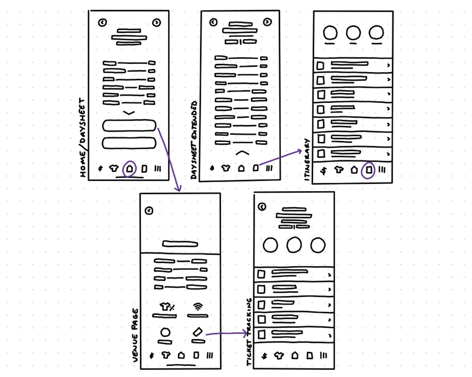
Once my branding for the app was solidified, I began to wireframe out exactly how I thought the app should flow. This process involved sketching, testing, and reiterating my ideas. At first, a paper prototype of my app was created so I could physically move the screens around and decide on the menu hierarchy and order. This step allowed for me to conduct user testing and record my findings whilst also considering user comments and concerns. After the order of screens was decided on, and changes were made based upon the research conducted, I began to wireframe first on paper. Wireframing on paper allowed me to get a general idea where the elements should lay on each page. Through numerous rounds of coming back to the drawing board, a direction was finally solidified and I was ready to start branding my app with the elements chosen during my research.


WEB DESIGN
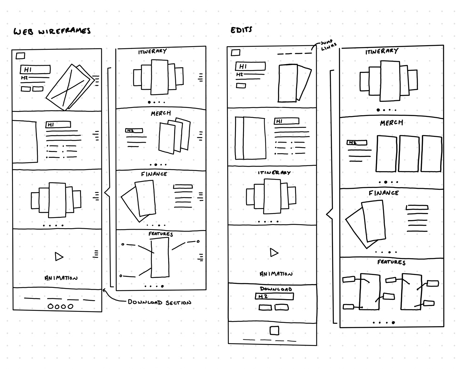
Perhaps one of my favorite steps in the design process is seeing the entire project come together in the end. When I was finished wrapping up my app and promotional video, I wanted to present this to potential users in a simple way. I built the informational website in Webflow to test out some fun new features offered, such as scroll effects and jump links. I found that with most single-page web sites, jump links allow the user to find the information they’re looking for quickly. After a process of wireframing the website in Sketch, I built out the elements in Webflow then began adding details and copy. Mockups of iPhones showcasing different features are spread throughout the website, allowing the user to get a good idea what the app contains before committing.


